Happy Friday! Here's an update on the state of the game from none other than Max Schaefer. Have a great weekend everyone.
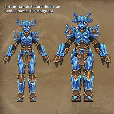
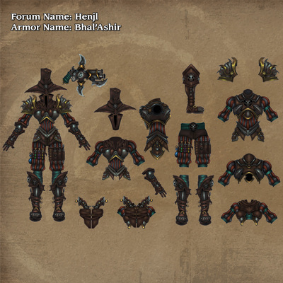
The results of the armor contest are in! Congratulations to our winners! Yes, you read that right, winners plural! We had some great entries with a lot of elements we admired and realized we had a great opportunity to feature a Heavy Armor set and Light Armor set. Both armor sets required very little alteration to work with our style, so the Art team had the bandwidth to incorporate both sets into the world of Torchlight II. Here's what Art Director Jason Beck had to say about the winners - The Crystalform Guard by Seaurchinstosun and the Bhal'Ashir by Henlj.
The Crystalform Guard set focused on a huge element of the Torchlight world, Ember, and it's no small feat to make a crystal armor set actually look good. This set is designed in a way that we can basically plug it into the lineup because it nailed so many of our style guidelines. Having the flexibility to make sets with different colored Ember crystals is a nice bonus as well. Well done.

The Bhal'Ashir set, while targeted at the Outlander class, actually makes a great mid-level multi-class set of armor. It falls in place really well between each classes' starter gear and our Colonist Line of armors. While we did need to simplify and embolden some design elements, the vibe and flavor of the design really appealed to people and fits into the game incredibly well. And really, who doesn't want that hat? Nice work.

We can't wait for you to see your armor sets in the game. They are a fun addition from our talented community. Congratulations!
