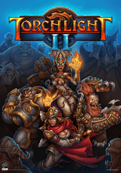
As part of our Christmas fun, we're excited to announce a Winter Contest for our community. We know there are lots of talented artists among our forums. You've shared some of your work with us, and your creativity is fantastic! Well, how'd you like the opportunity to design a full armor set for Torchlight II? Now's your chance! Below are the rules from Art Director Jason Beck. We can't wait to see your work. Happy sketching over the holidays!
Contest Rules:
- Submissions must be made to the Runic Games Forums no later than 10:00am PST on January, 9, 2012. Earlier 'Work In Progress' submissions are HIGHLY encouraged.
- Required submission is a jpeg or png no larger than 1920x1200 at 72 dpi. The image must be hosted elsewhere and linked to the forum Thread. The image MUST be placed within [spoiler] tags. You are free to use whatever image hosting service you like, some common ones include:
- Optional supplemental submission can be written information such as:
- Desired Armored Set Name
- Desired Stats/Properties
- Small blurb about the Armor Set either written as lore or from the designer's approach.
- Design must be original and cannot contain elements from copyrighted works, references to other IP, or use any images that you do not own.
- No long robes or dresses.
- No animated textures or spell effects.
Questions and Answers
- What do you win?
- One winning armor set design will be chosen to be modeled, textured and put into Torchlight II as a Unique Armor Set!
- The creator of the winning armor set will also receive a Torchlight II poster signed by the team.
- Is there only one winning armor set?
- Yes. Only one armor set will be modeled and put into the game.
- We may choose some Honorable Mentions that will receive a Torchlight II poster signed by the team.
- What is the best way to draw an armor set?
- A 'paperdoll' with both front, back, and either profile or 3/4 views are our preferences, but you can submit it as more of an illustrative piece.
- While we will accept any type of illustration it is important to note that this is not a 'who can render armor the most beautifully' contest… it is a 'design contest', so even if the art is line work with flat colors we will consider it. In the end, the best design will win, not necessarily the prettiest picture.
Some Helpful Guidelines:
- Feel free to break all or some of these guidelines, but realize the concept may have to be heavily modified to make it work in game and may remove you from consideration due to technical constraints.
- Many concepts are incredibly creative and beautiful, but break down when it comes to the functionality of creating in game assets. Ultimately, at the end of the day your concept has to work within the confines of a system and like all systems it has limitations.
- Armors are made as 'sets'. As such, your concept should include the understanding that it will be broken down to its corresponding parts. Currently these are as follows:
- Helmet
- Gloves
- Chest
- Pants
- Boots
- Create a male and female version. These can be largely the same, but don't forget there are 'differences' in the shape the armor must adhere to.
- Keep in mind clipping when armor is in motion. Huge helmets and shoulder pauldrons can look cool… until you turn your head sideways and defy the laws of physics. Minor clipping may on occasion happen, but major clipping is avoidable with planning.
- Keep in mind our Art Style and the game View. Most characters will be seen from a 3/4s Top Down view and extremely minute details will be lost or look like busy noise. Design a strong silhouette from our default view rather than from the front as you only see it that way in your inventory screen.
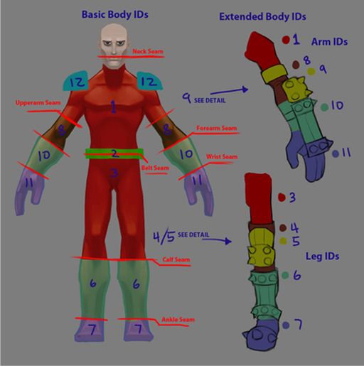
- When creating assets for games there are seam lines where the models swap in and out, creating armor pieces that break these seam lines can be problematic and may ruin their ability to interact with other armor sets. Figure 1 (click here for full size) below is a guide where our major seams and IDs are to help you in planning your set.
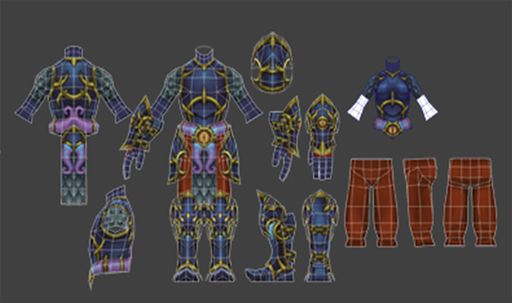
- Figure 2 (click here for full size) below is a rough example of some of our geometry to give those of you familiar with 3d modeling a bit more info on the models/pieces.


